In the fast-paced digital landscape, building a mobile website that seamlessly adapts to various devices is a must. With the right combination of HTML, CSS, and JavaScript, you can create a mobile web experience that captivates users from the first click. This guide will take you through the intricacies of code, providing insights on how to build a mobile website that stands out in the crowded online space.
1. Lay the Foundation with HTML:
Start by setting up the basic structure of your mobile website using HTML. Consider the following essentials:
<!DOCTYPE html>
<html lang="en">
<head>
<meta charset="UTF-8">
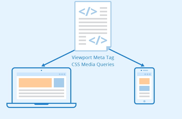
<meta name="viewport" content="width=device-width, initial-scale=1.0">
<title>Your Mobile Masterpiece</title>
<link rel="stylesheet" href="styles.css">
</head>
<body>
<!-- Your content goes here -->
<script src="script.js"></script>
</body>
</html>
2. Responsive Design with CSS:
Harness the power of CSS to make your website visually appealing on any screen size. Utilize media queries for responsive styling:
/* styles.css */
body {
    font-family: 'Roboto', sans-serif;
}

/* Mobile-first styles */
.container {
    width: 100%;
    padding: 20px;
}

/* Responsive styles for larger screens */
@media screen and (min-width: 600px) {
    .container {
        max-width: 600px;
        margin: 0 auto;
        padding: 40px;
    }
}
3. Prioritize Mobile-Friendly Navigation:
Craft an intuitive navigation system with touch-friendly elements. A hamburger menu is a great option for conserving space on smaller screens:
<!-- Inside your <body> -->
<div class="menu-icon">☰</div>
<nav class="mobile-menu">
<!-- Your menu items go here -->
</nav>
4. Optimize Images for Speed:
Compress and optimize images to ensure swift page loading. This is crucial for retaining user interest:
/* styles.css */
img {
    max-width: 100%;
    height: auto;
}
5. Inject Interactivity with JavaScript:
Enhance user engagement by incorporating JavaScript. Use it for dynamic elements, form validation, and other interactive features:
// script.js
document.addEventListener('DOMContentLoaded', function () {
    // Your JavaScript magic here
});
6. Test Across Devices and Browsers:
Regularly test your mobile website on various devices and browsers to iron out any compatibility issues. This step ensures a consistent experience for all users.
7. Deploy and Optimize:
Once satisfied with your creation, deploy your mobile website on a server. Additionally, consider tools like Google PageSpeed Insights to optimize performance further.
In the realm of mobile web development, the code you write is the brush with which you paint your digital masterpiece. By following these steps and continuously refining your code, you’ll be on the path to creating a mobile website that not only meets but exceeds user expectations in this dynamic digital age. Happy coding!